ODER
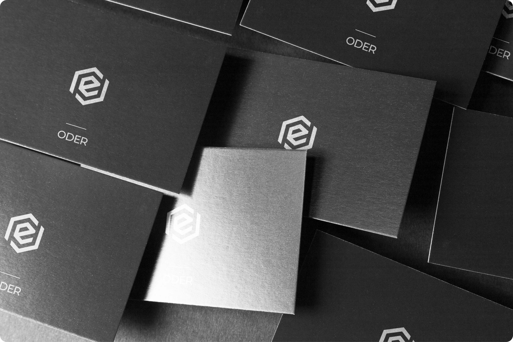
ODER is an IT-company identity built around a geometric mark and an open outline. The same shape develops into frames for text and photography, connecting the logo with a wider graphic system. The applications show how it works across screens, stationery and signage.
My work: logo variants, spacing rules, colour palette, typography and application layouts
A brief about openness
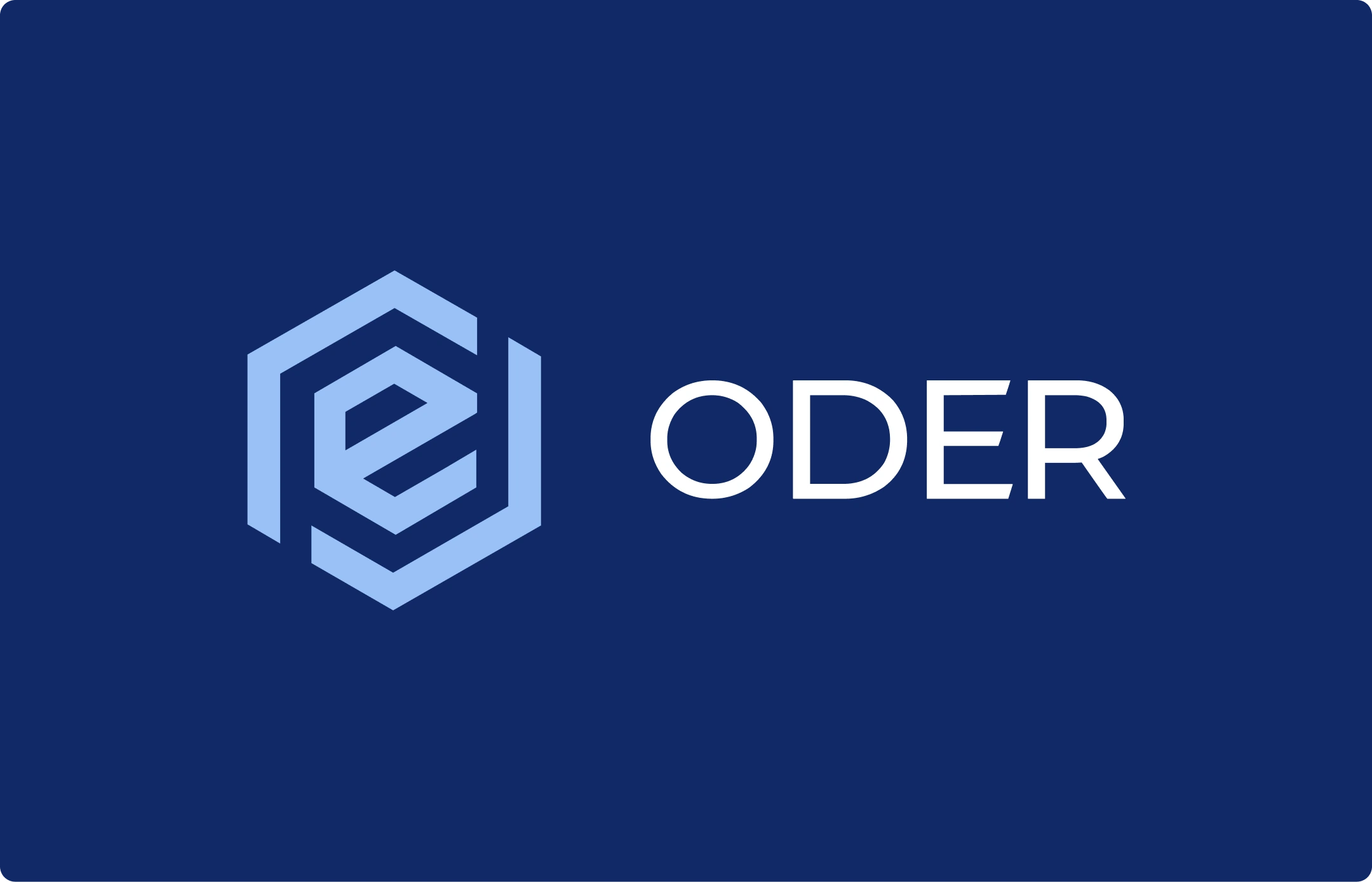
Openness and communication with clients needed a visual form. I chose a geometric outline with breaks: a precise construction that stays open. This feature became the basis for the wider graphics, with angular frames and open boundaries around text and images.
The geometric mark
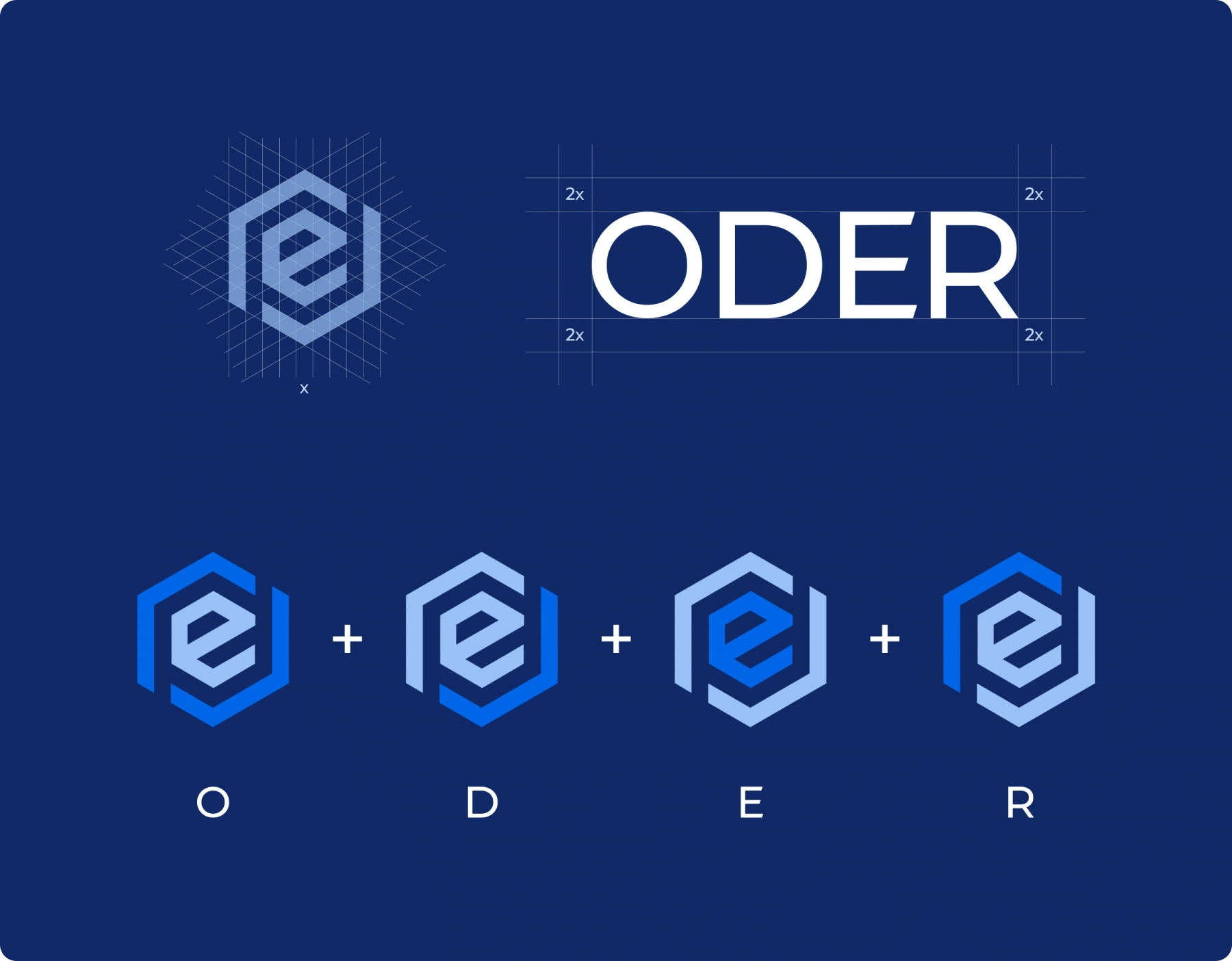
The symbol uses a hexagonal outline and open segments. I separated it into a standalone mark and a full signature with the name so it could work in different settings. A construction study records the proportions, while clear space preserves the silhouette beside other elements.
An icon and a building sign
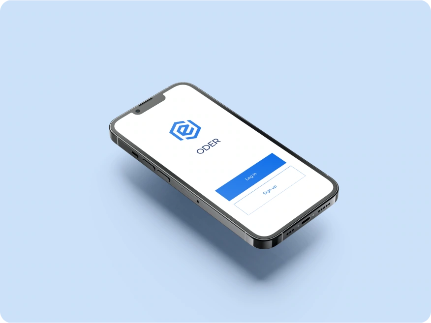
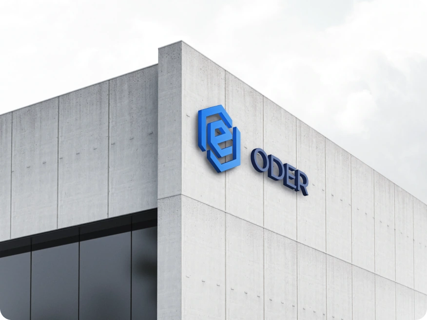
An app icon and a building sign need different amounts of information. A small square uses the symbol alone; a façade adds the name. Both versions share one mark, with the relationship between symbol and text adjusted to viewing distance and the size of the surface.
The base identity rules
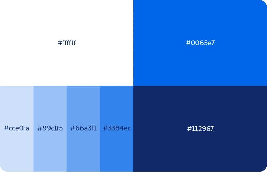
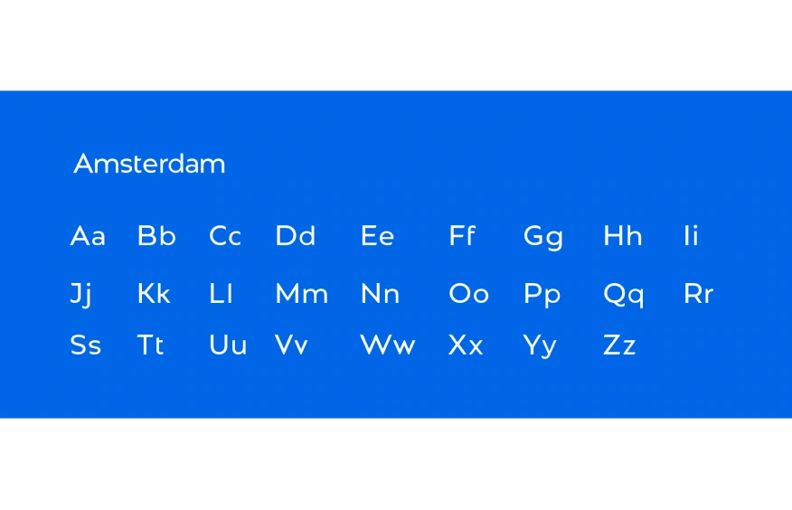
The palette uses white, bright blue and navy. Light and dark bases offer different settings for the mark, while Amsterdam sets the original typography. Shared spacing, colour and proportions connect a card, screen and building sign as their materials and viewing conditions change.
From a mark to a graphic system
The open logo outline provides the starting point for the frames. It becomes a graphic element on a large field, a boundary beside text and a way to crop photography. This extends the identity through an existing shape. Montserrat supports the same geometry in titles and supporting text.