Nebula Ops
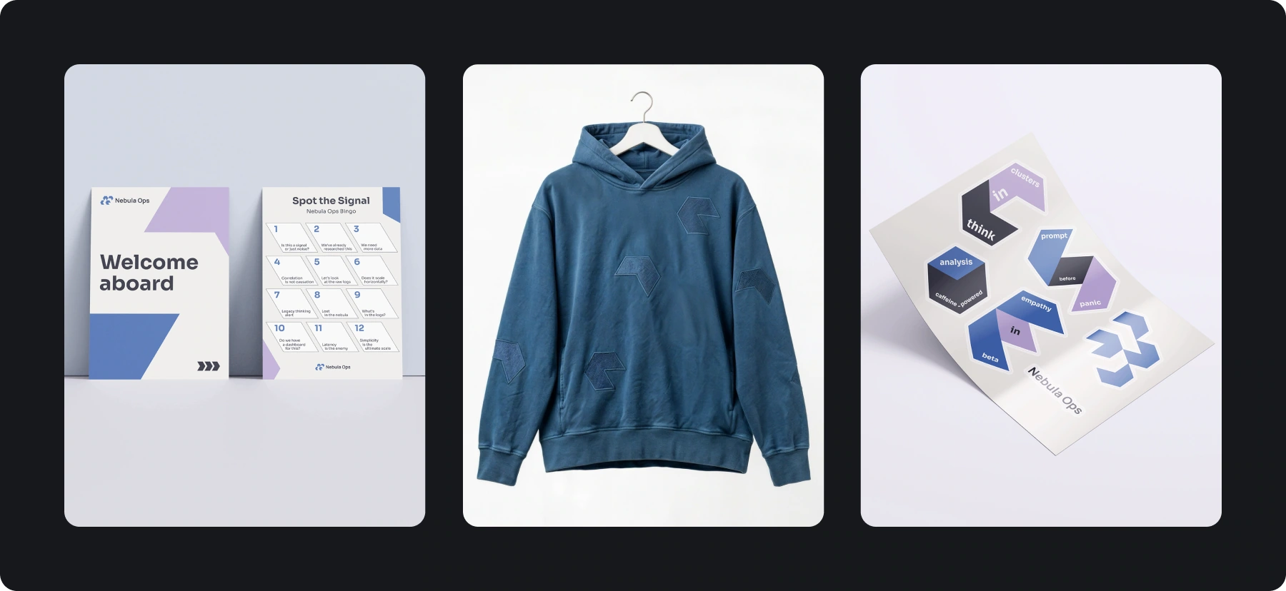
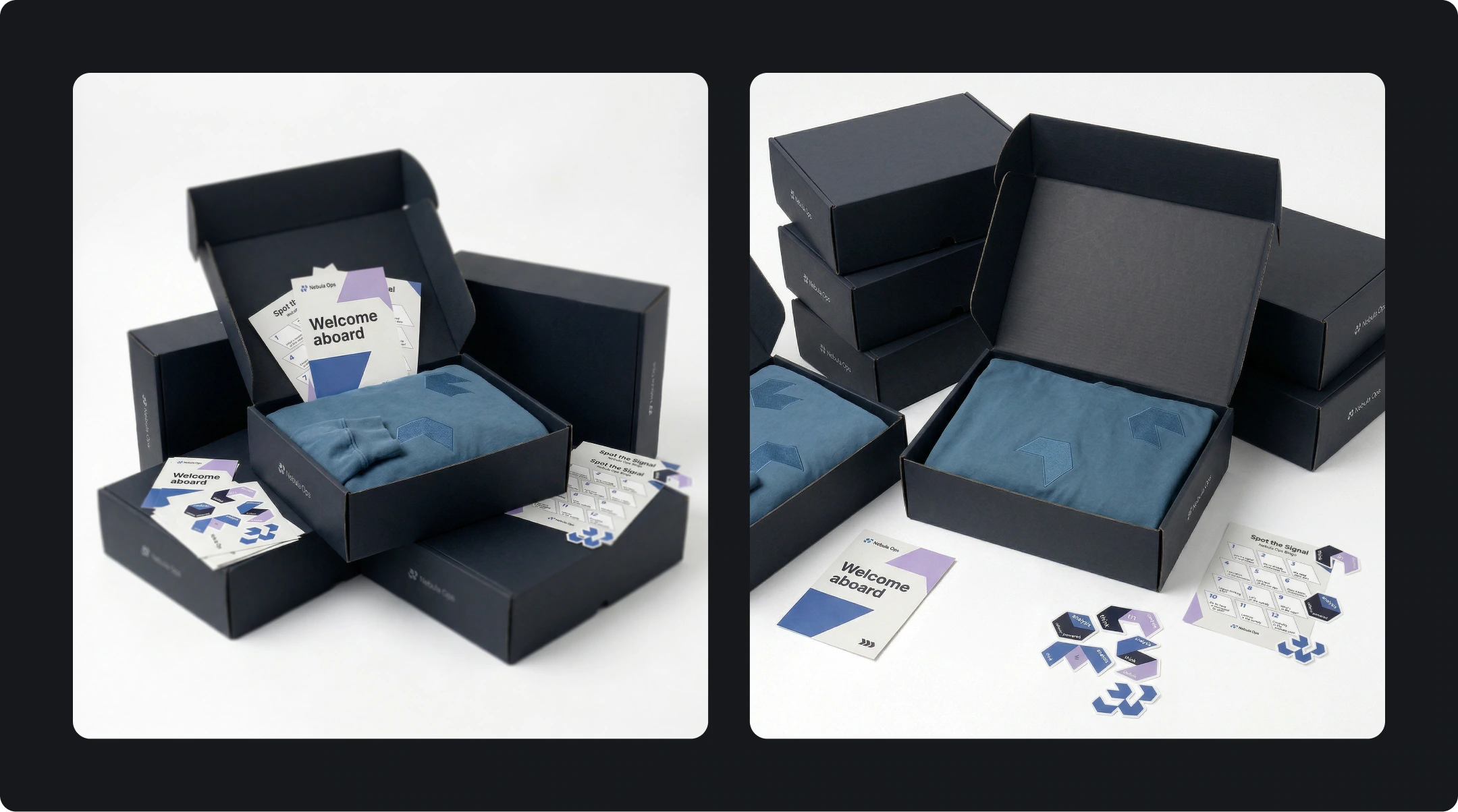
Nebula Ops is an internal research team working with large datasets. Its identity introduces the team through a welcome kit: a box, card, stickers and hoodie. Geometric modules connect these objects while leaving each one its own scale and composition.
My work: identity, mark, colour palette, typography and welcome-kit layouts
A first introduction to the team
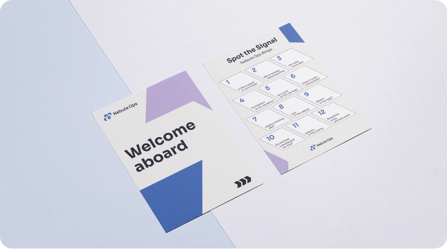
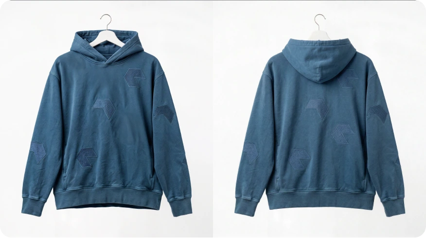
A welcome kit is an early point of contact: a new colleague sees the objects before learning the team’s habits. I connected them through shared graphics. The box brings the kit together, the card addresses the person, and the hoodie and stickers carry the introduction beyond the unboxing.
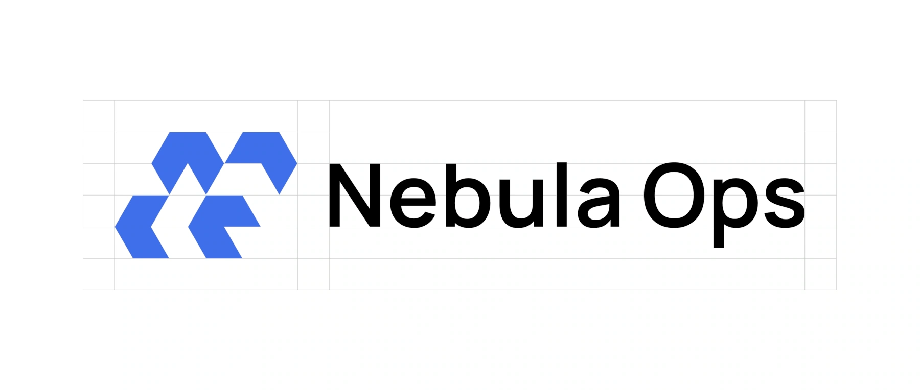
Modules for the mark and graphics
Research and data work provided the starting point for modular graphics. Geometric elements form the mark, then change scale to become patterns. This links a small sticker to a large box surface. A dark base holds the series together, with blue and lilac bringing attention to details.
Two typefaces, a shared hierarchy
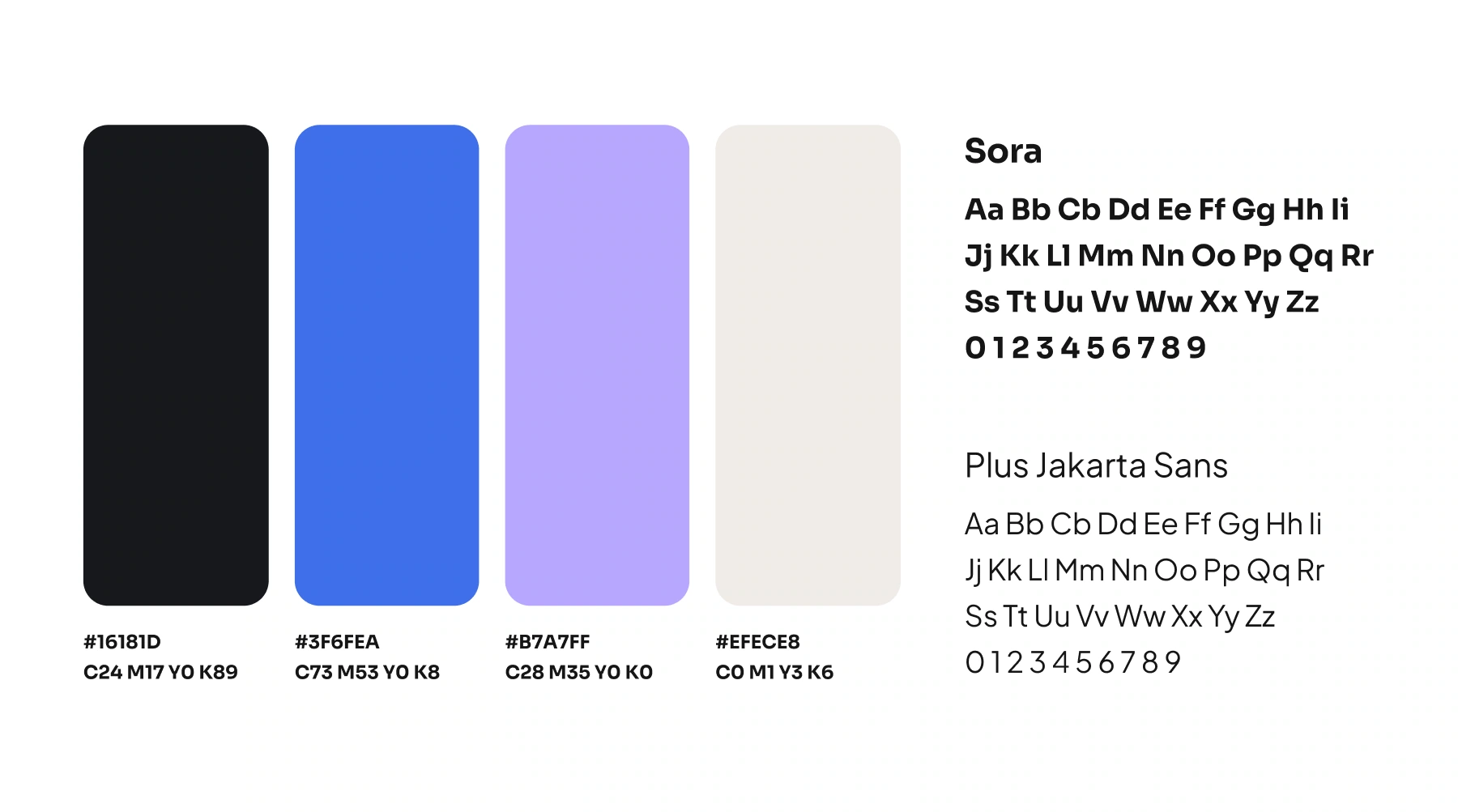
The kit includes short greetings, large statements and small information. Each needs a different type density. Sora and Plus Jakarta Sans organise these levels: a heading leads the layout and supporting text takes less space. Open areas leave room for the graphics and help the objects belong to the same kit.
One system across the kit
The surface determines how much graphics it needs. The box uses a large composition, the card balances its message with a pattern, and the hoodie uses individual accents. I keep the elements consistent while changing their scale and position to suit how each object is used.