Atom Pace
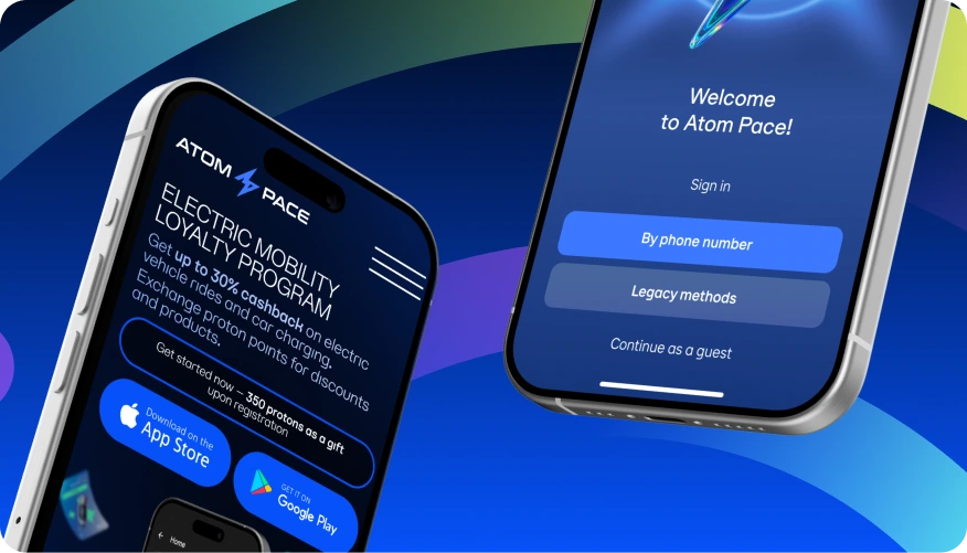
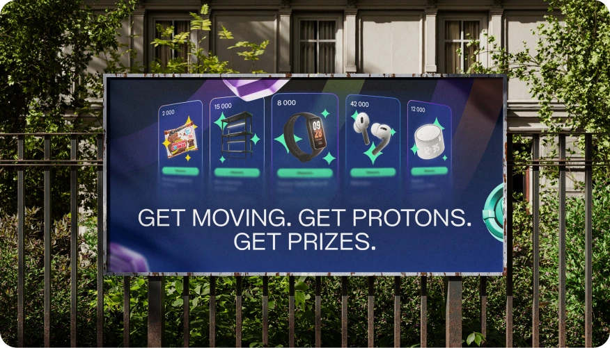
Atom Pace links everyday city travel with rewards. The identity carries the app’s activity rings into social content and outdoor advertising, connecting the product with its campaign materials. The name and some details have been changed under NDA.
My work: logo, graphic language and layouts for the app, social media and outdoor advertising
Arcs from the product
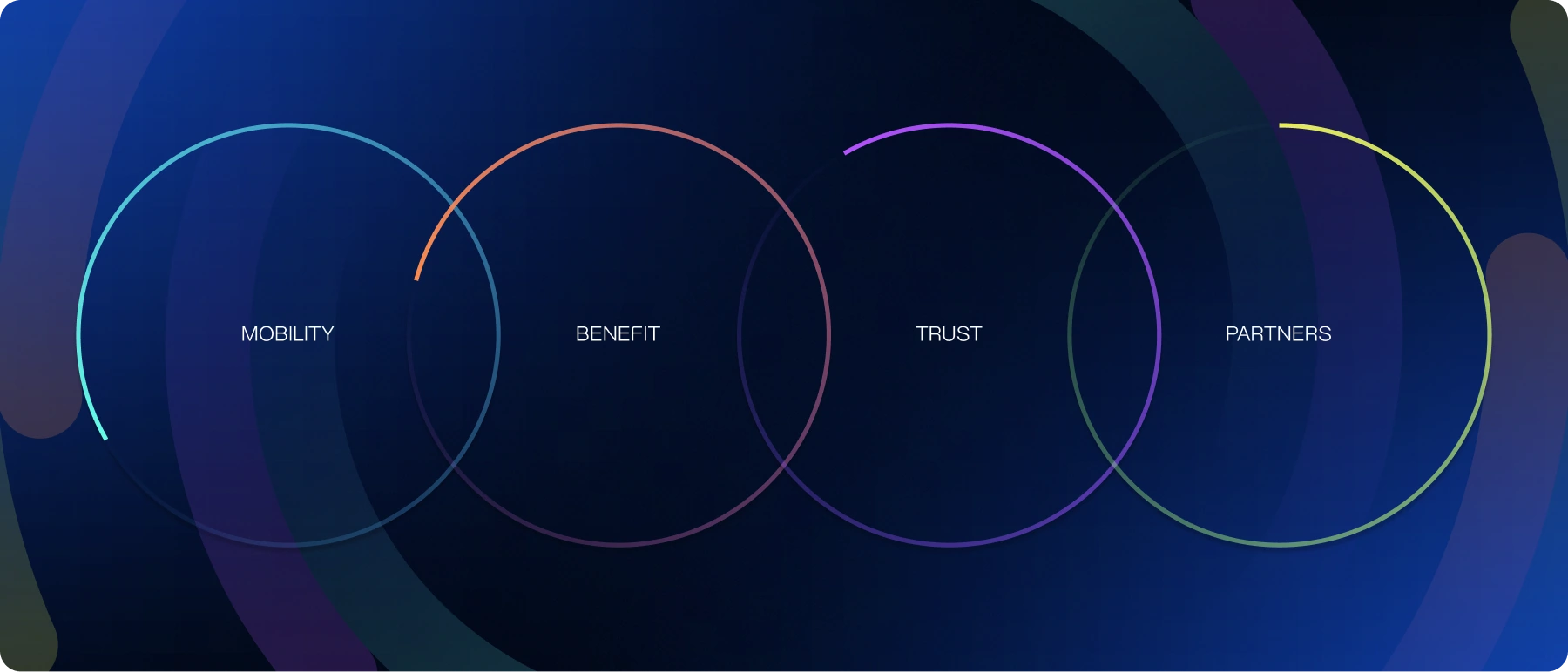
Activity rings in the interface show progress towards a daily goal. I used their arcs as the base of the identity so advertising could continue the product’s visual language. An arc can become a colour field or frame a message, letting one element work on a screen and in outdoor advertising.
A mark for the app icon
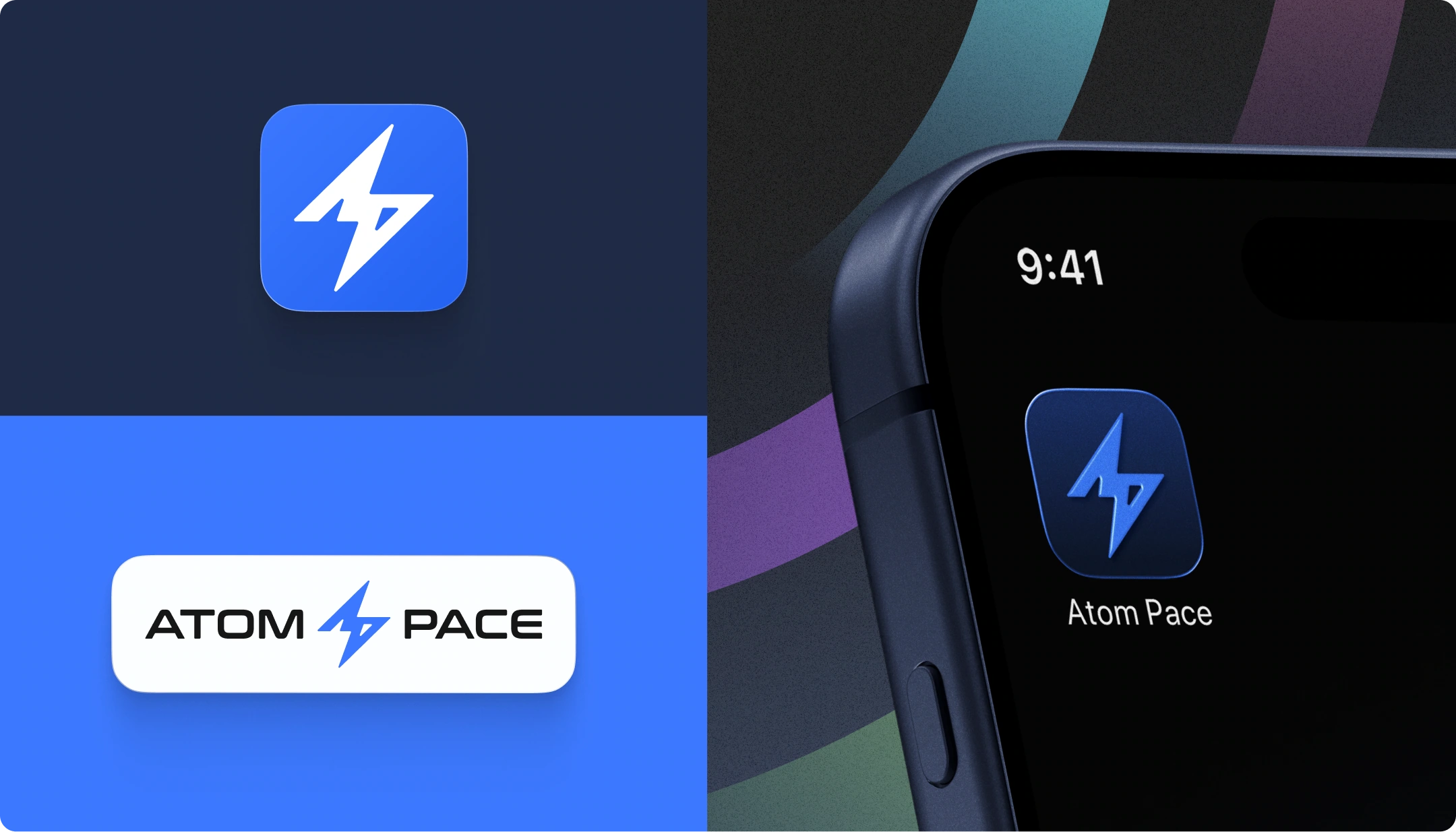
An app icon needs a compact silhouette that uses a small area. I built it around a solid lightning shape with clear edges. Larger applications add the name. Separating the symbol and signature lets the text change size while the symbol stays consistent.

A system for different messages
The communication covers four topics: mobility, rewards, rules and partners. Each brings a different emphasis: an action, a benefit, a condition or an offer. I keep the graphics consistent and change the message, connecting a post that explains the rules with one that invites participation.
Social media and outdoor layouts
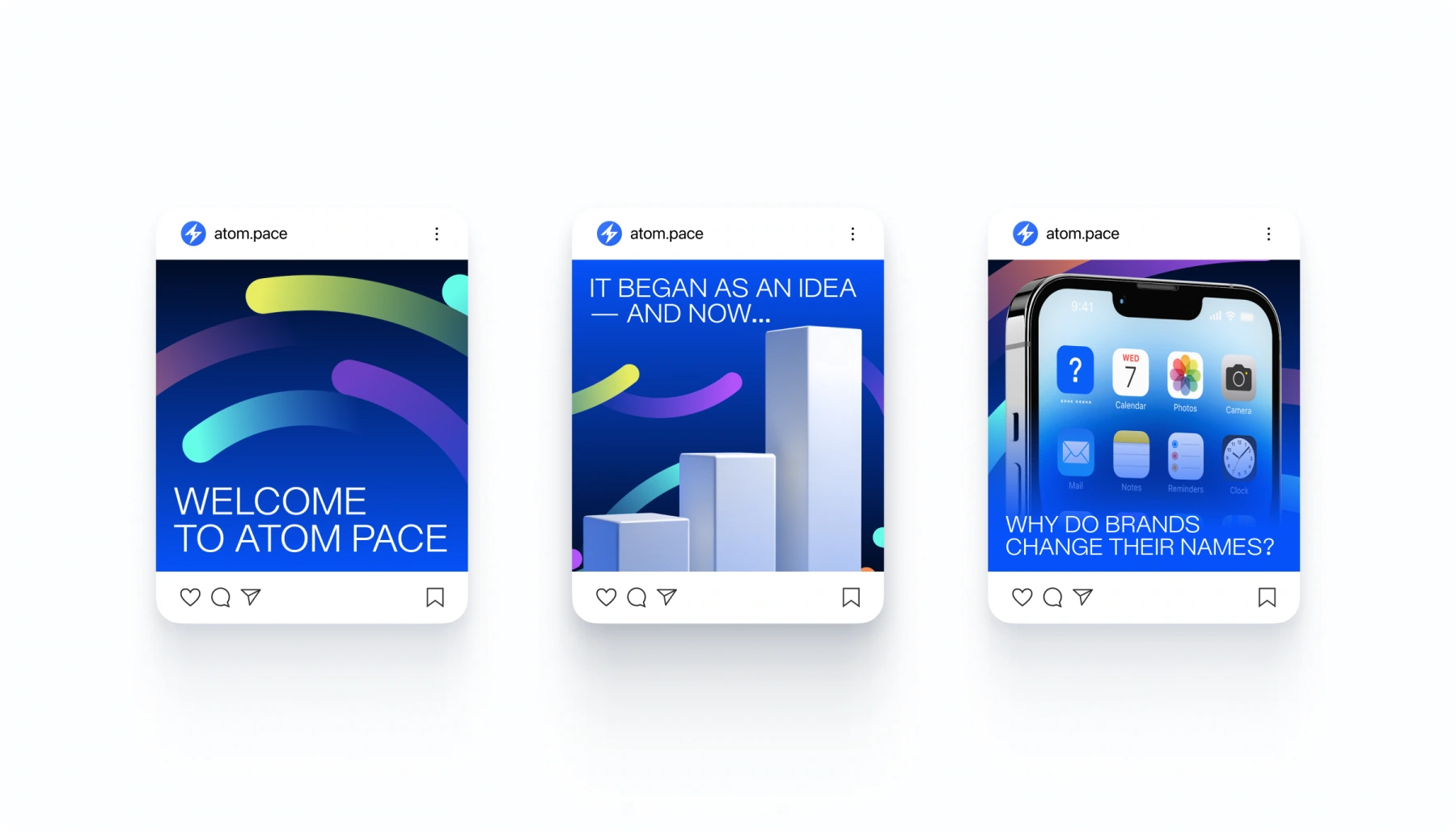
Outdoor layouts lead with a short, large headline; social posts have space for more detail. Arcs frame the content and create colour fields within the same structure. I adjust the scale of type and graphics to the format, keeping both short messages and detailed layouts connected to the app.