Lumifly
Lumifly is a paper-plane brand built around learning through making and play. The identity connects folding and flight with a mark, a colour palette and a series of campaign layouts. The same visual rules carry the brand from small social posts to larger advertising formats.
My work: logo variants, colour palette, typography and campaign layouts
From an activity to a visual idea
Fold, launch and try again: the activity sets the character of the product. I started with a paper plane because it connects the brand to that action and works for both learning and play. The next task was to keep this idea in a small mark and carry it into advertising.
The mark and its variants
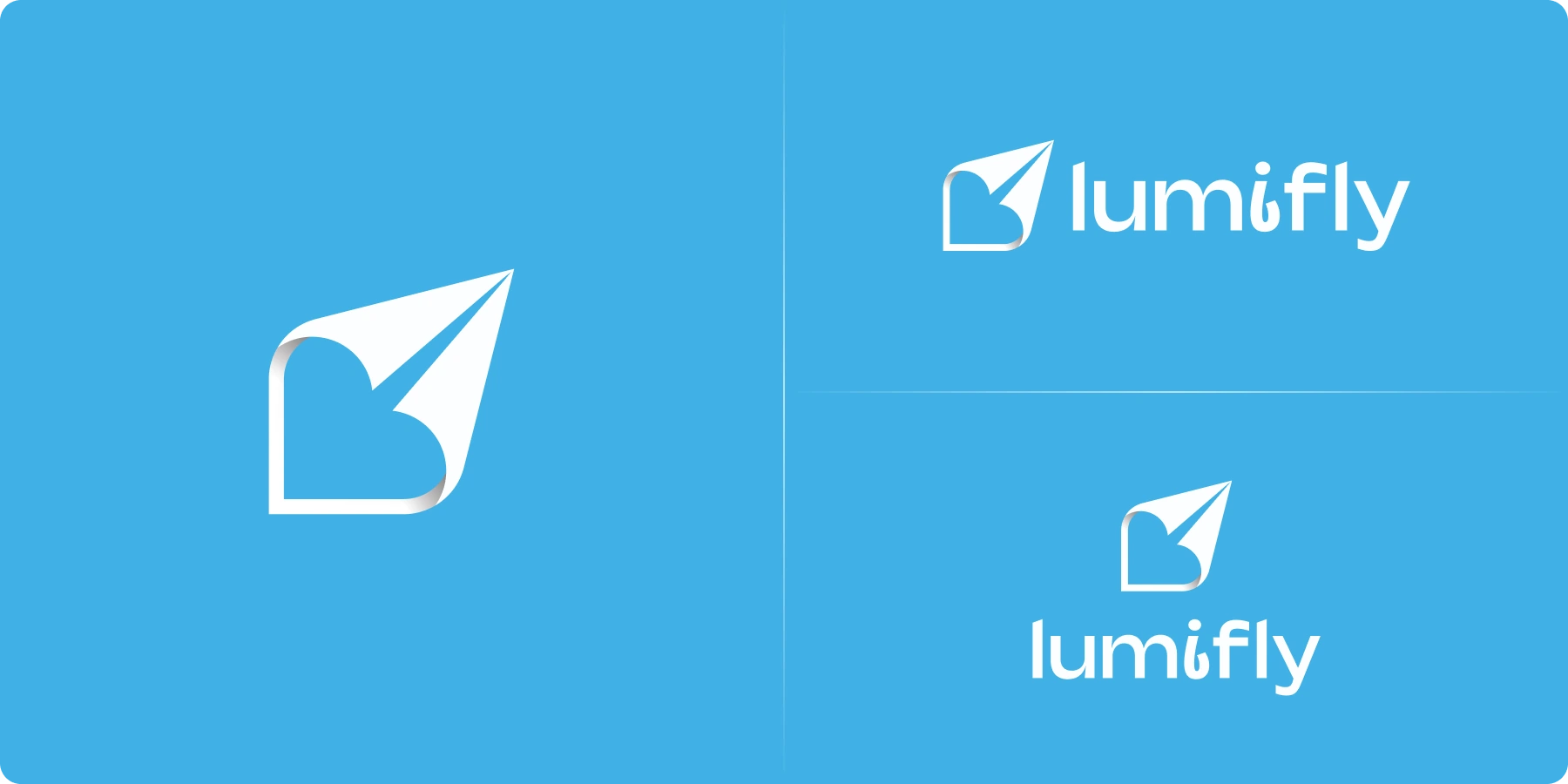
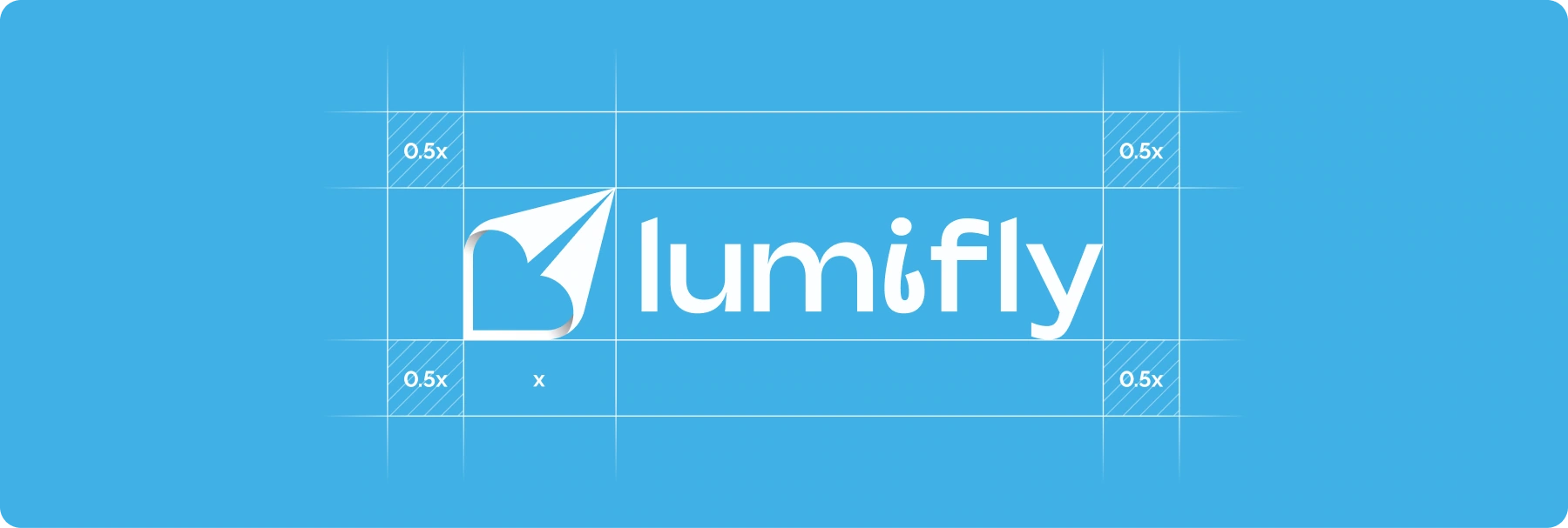
The plane and heart share one silhouette. This links the symbol to the product and adds a sense of enjoyment. Small formats use the symbol alone; larger layouts pair it with the name. Shared proportions and clear space keep the shape consistent across applications.
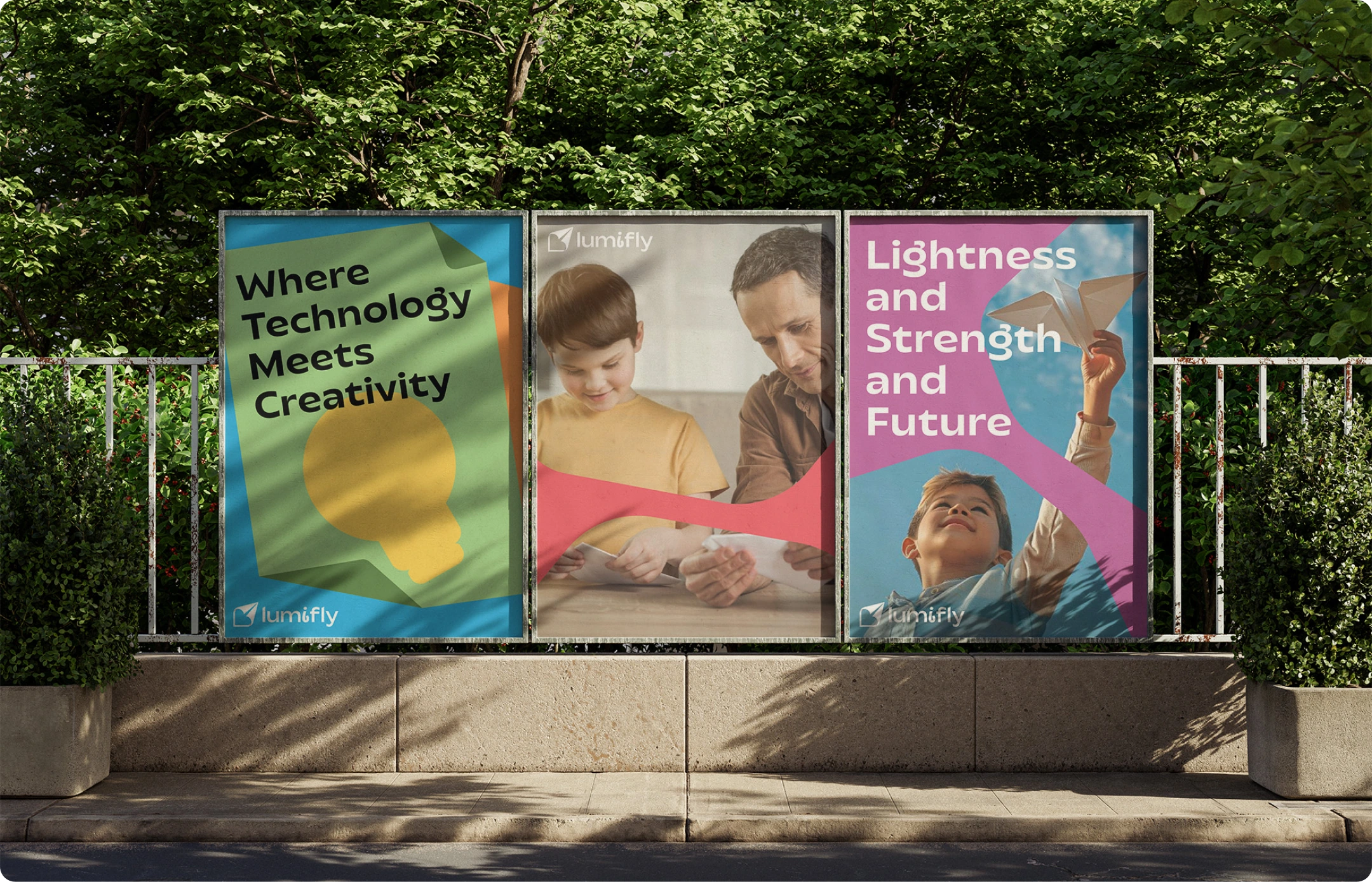
Type, colour and campaign materials
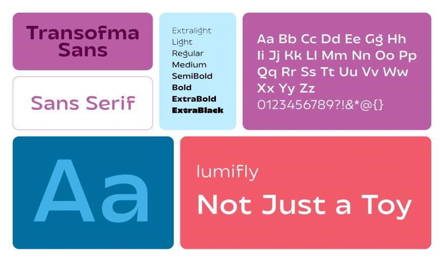
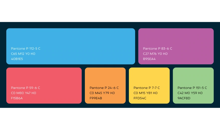
A six-colour palette gives each layout its own mood. To connect them as the background changes, I kept Transforma Sans, a consistent use of the mark and large type. The subject and colour can follow the message while the underlying visual rules stay the same.
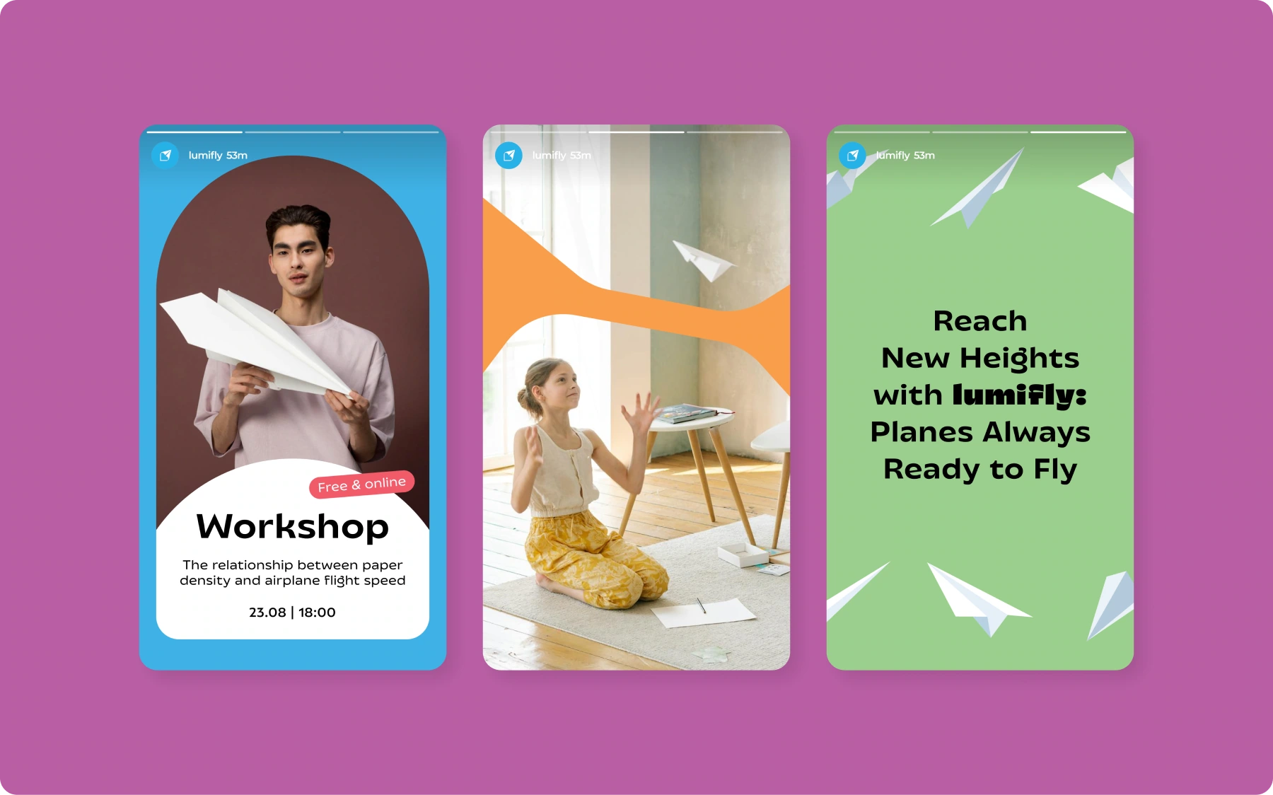
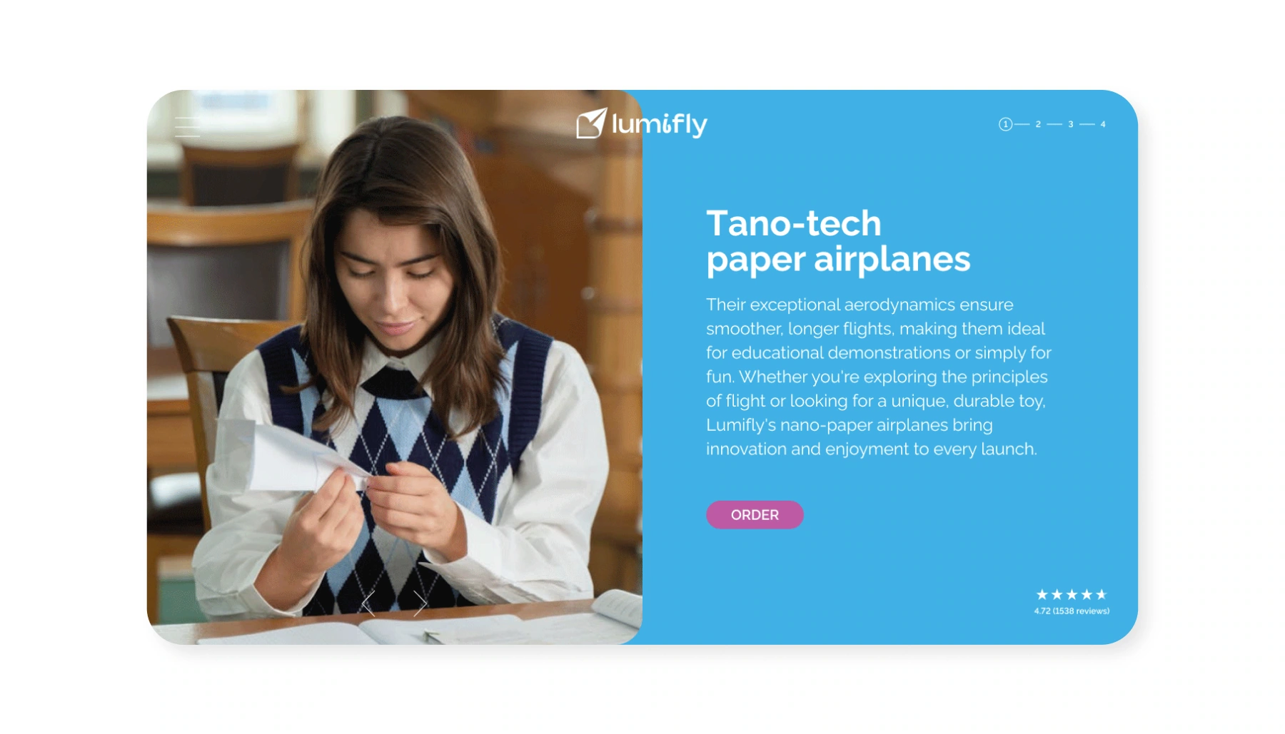
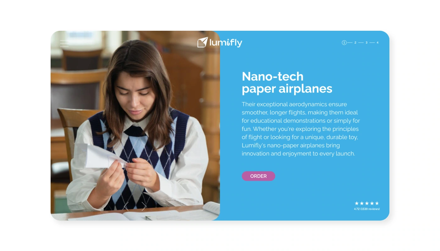
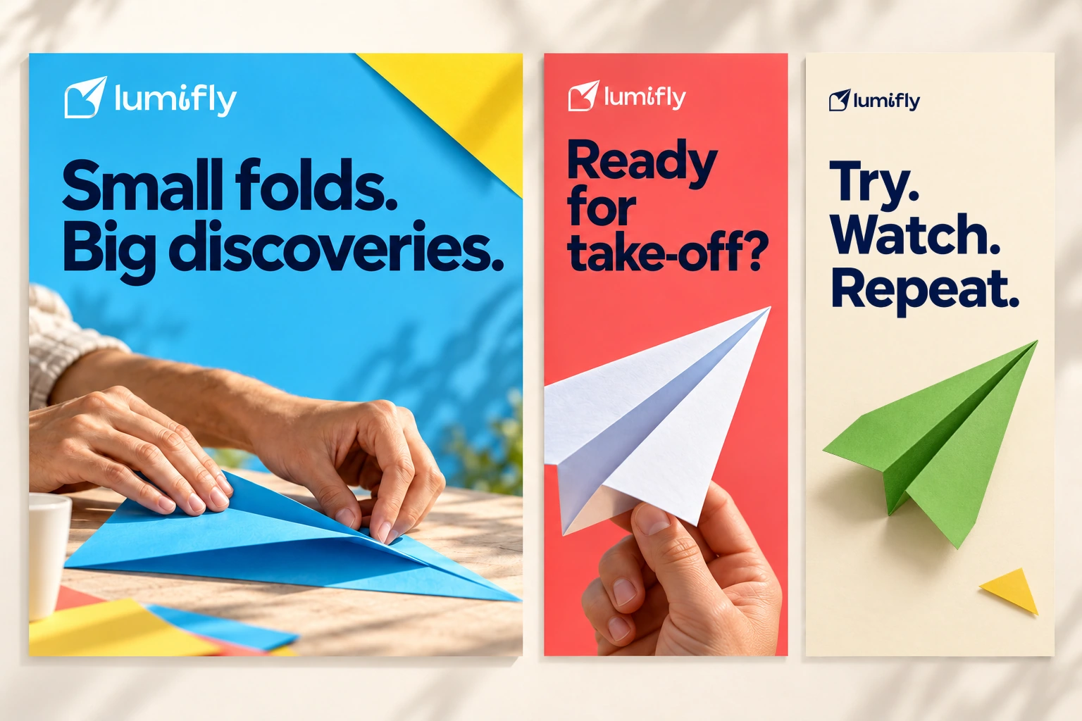
Fold first, then launch
I built the sequence around the activity. The large layout shows hands folding the plane and introduces the process. Red shifts the focus to launch; green shows the finished plane. Each image has a role in the sequence. Short headlines and a shared type scale connect the three scenes.